MoPH Qatar Public Health Strategy

MoPH Qatar Public Health Strategy

MoPH Qatar Public Health Strategy

Objective
Design and produce online and print reports of Qatar’s first National Public Health Strategy. Promote the launch of the Public Consultation of Qatar’s National Public Health Strategy. Realize a significant public participation in the survey during its launch period.
Challenge
The public, by instinct or assumption, might take no notice of our messages only because they were coming from a government organization, banal and dull. Our call-to-actions, if not carefully addressed, might “dictate” to the public. Unfortunately, that tone would ignite negative emotions, whereas this initiative was all about the public’s well-being and the most valuable part of it was the ministry’s empathy for the people by listening and understanding them. The strategy features extensive content and consists of a highly technical language, an extraordinary challenge especially for the online audience.
Answer
People hate to be told what to do. They look for empowerment and guidance that lead to better lives. Knowing this, we have concentrated on the empathizing perspectives and the educational elements of the strategy. And added a rewarding engagement in our communication experience, which altogether resulted in off-the-charts conversion rates and participation in the end. Moreover, viewers could easily get the purpose of the strategy, identify his/her interests and learn more about them while not feeling overwhelmed by the bulk of the information. They were able to do it whether being at the launch event looking at the stand branding, or viewing it online on a mobile device or reading it from the printed version.


Powerful Imagery 

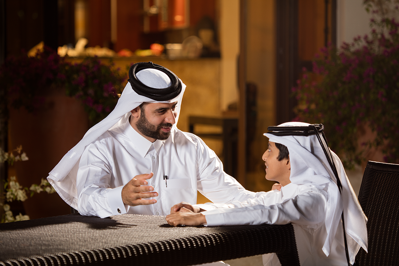
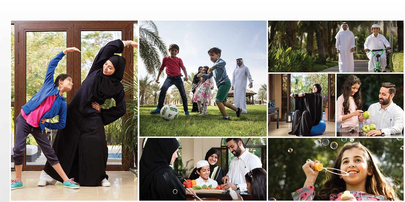
We conducted professional photo-sessions, capturing subject relevant and authentic moments. We used lots of those exclusive lifestyle photographs in our communication for the Qatari public to relate easily.

Economy of Language

The large content drove us to think differently. The client collaborated on making the text less academical, and we encouraged brevity, which turned the technical report to easy reading. It was especially this effort that helped all activities to be received well and by many.

Functional Design

We set a distinctive art direction for the strategy and all communication linked to it. Unified the design styles for similar portions of the chapters, which helped us to restructure the content to allow frequent pauses…..

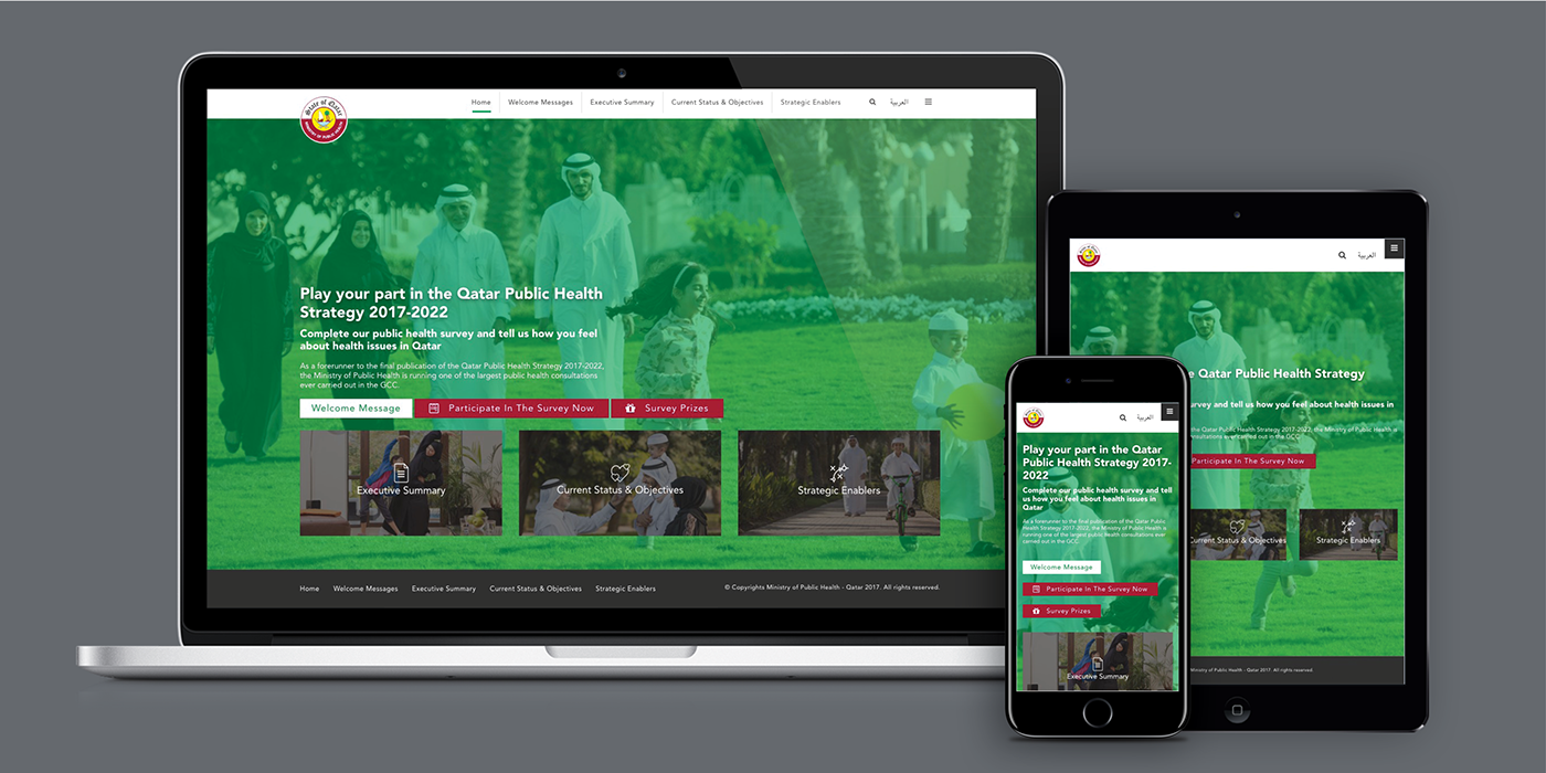
We did it with slight differences for print and online versions, understanding the unique experiences of both mediums. For instance, we applied a modern blog style user experience for the online version, to suit an easy navigation on any device. . . .

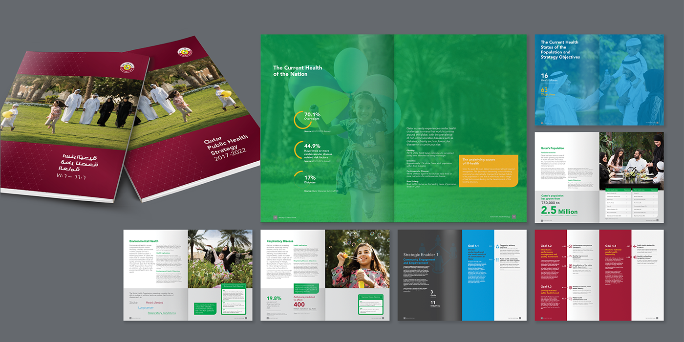
The print version was a combination of a lifestyle magazine and a university annual, which conveyed both approachability and the seriousness at the same time. So that, it was easy for the reader to find information and refer to its sections.

The Survey

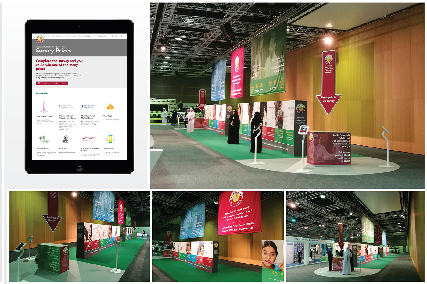
To align with the wants, needs, and hopes of the people of Qatar, MOPH has invited every individual in Qatar to review the strategy and complete the country’s biggest health survey – so people could tell how they felt about public health issues in Qatar. The gateway to the online survey was the PHS website that we designed and developed.
MOPH launched the PHS Consultation Survey with an event, which has held keynote presentations, a panel discussion, and an exhibition stand where more than 3 thousand healthcare delegates and invitees from partner stakeholders and students attended.

Social Media

Following the launch, we ran a paid social media campaign for four weeks to boost participation and create awareness. To that date, the client has been active on Twitter and Facebook; consequently, those were the only two channels we had to use.

Results

During the campaign period (May/8/2017 – June/4/2017) we have generated 4.9 Mill Impressions and 68k clicks Twitter and Facebook combined. In the first-week people showed a keen interest in the survey, which resulted in an exceptional 37% Conversion Rate. The participation gradually decreased however generated about 15 thousand participants.
Credits:
Creative Director: Dinç Uvendire
Wunderman Qatar & Dubai, Tattoo
My Role:
User Experience/Interface Designer,
Graphic Designer, WordPress Content Editor