Basil – A Healthy Kitchen needed a brand identity that stood out in a highly competitive market and positioned it as a healthy and premium dining option.
Designing a Brand Identity that Represents the Fresh and Organic Values of Basil – A Healthy Kitchen
Developing a Brand Identity for a Fine Dine Restaurant
Branding
Logo Design, Brand Identity Design
Basil
Basil – A Healthy Kitchen needed a brand identity that stood out in a highly competitive market and positioned it as a healthy and premium dining option.
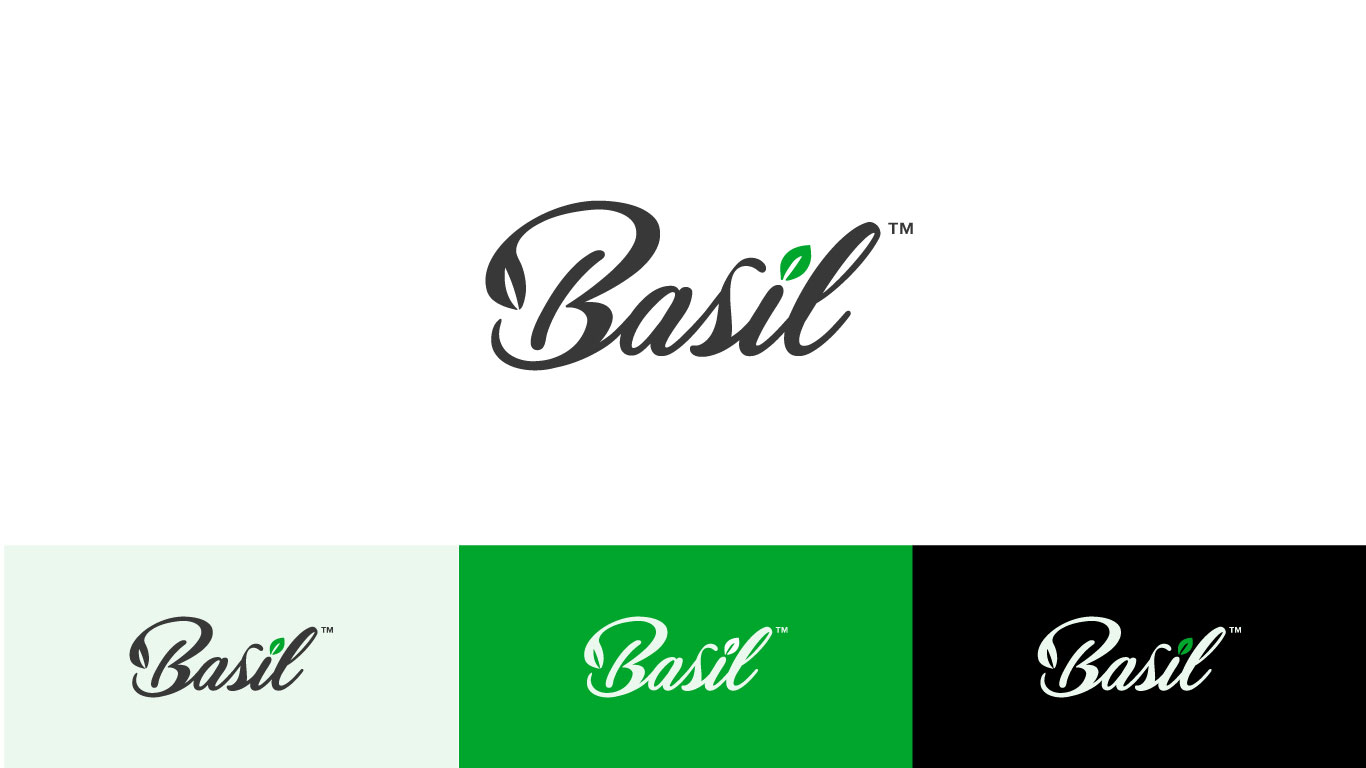
We conducted research and used the basil leaf as a part of the dot on top of the letter “i” and a cursive font to create a friendly, organic brand identity. Dark charcoal gray and green colors were used to represent elegance and health. This helped the restaurant stand out and attract its target audience, differentiating itself from the competition.
The logo features a cursive display font with a basil leaf on top of the letter “i.” The basil leaf represents the restaurant’s focus on fresh, organic ingredients, and the cursive font represents the restaurant’s friendly and approachable atmosphere. The dark charcoal gray color is used as the primary color to represent the restaurant’s elegance and class, and the green color represents the organic and healthy aspect of the restaurant.
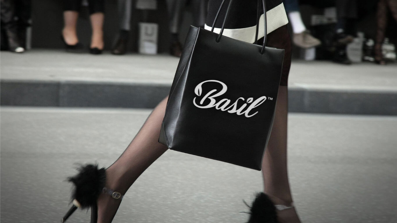
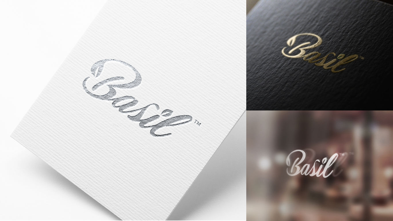
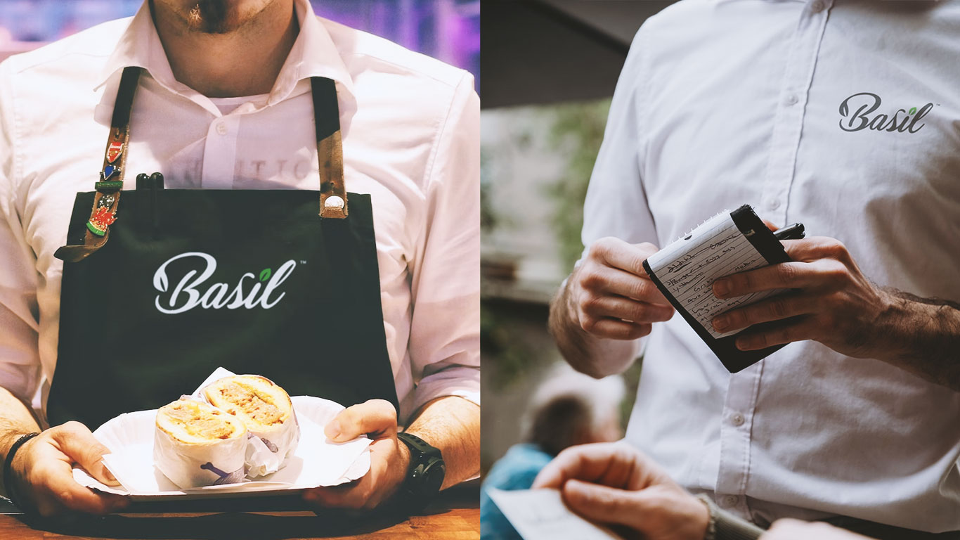
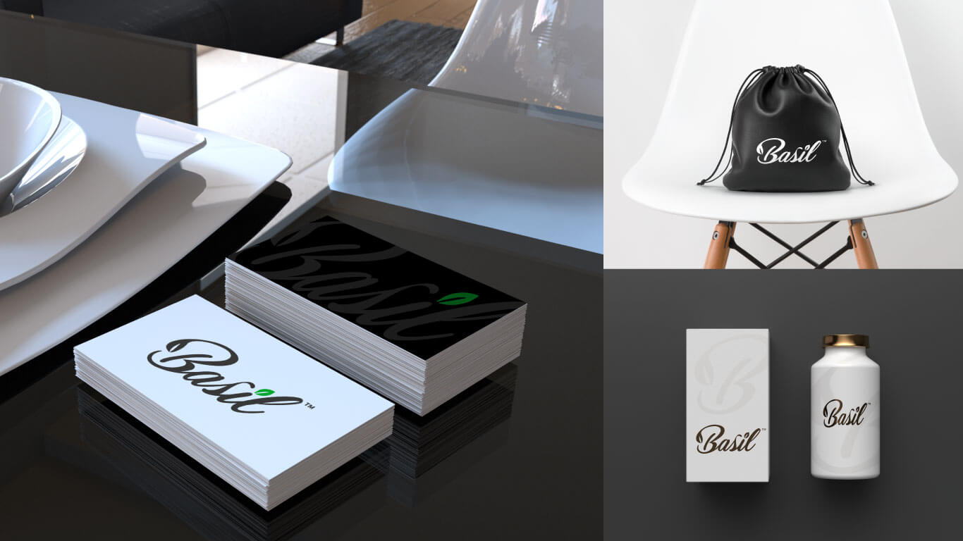
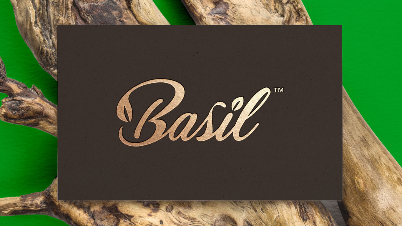
The brand identity design for Basil – A Healthy Kitchen was well received by the client and its customers. The logo and marketing collateral are eye-catching and appealing, representing the restaurant’s values and attracting its target audience. The brand identity has helped the restaurant to stand out in a competitive market and position itself as a premium, healthy dining option in Qatar.
The brand identity design for Basil – A Healthy Kitchen successfully reflects the restaurant’s core values and attracts its target audience. The use of the basil leaf and cursive font, along with the dark charcoal gray and green colors, has created a classy and organic brand identity that stands out in the market.
Blace Creative designed a brand identity that perfectly captures our restaurant’s values and mission. The use of the basil leaf and cursive font gives it a friendly, organic feel, while the dark charcoal gray and green colors represent elegance and health. Their attention to detail and creativity helped us stand out in a competitive market, and we’re grateful for their exceptional work.
Munna Al Aziri
Founder/ Basil – A Healthy Kitchen